
Many people associate the Canon logo with a vibrant red color. However, when you pick up a Canon camera, the logo appears only in monochrome colors such as white, black, or silver. Why is red not used?
There is a long-standing brand philosophy and design aesthetic hidden behind this choice. This article unravels the history of Canon's official logo and its different usages, exploring why the red logo does not appear on camera bodies.
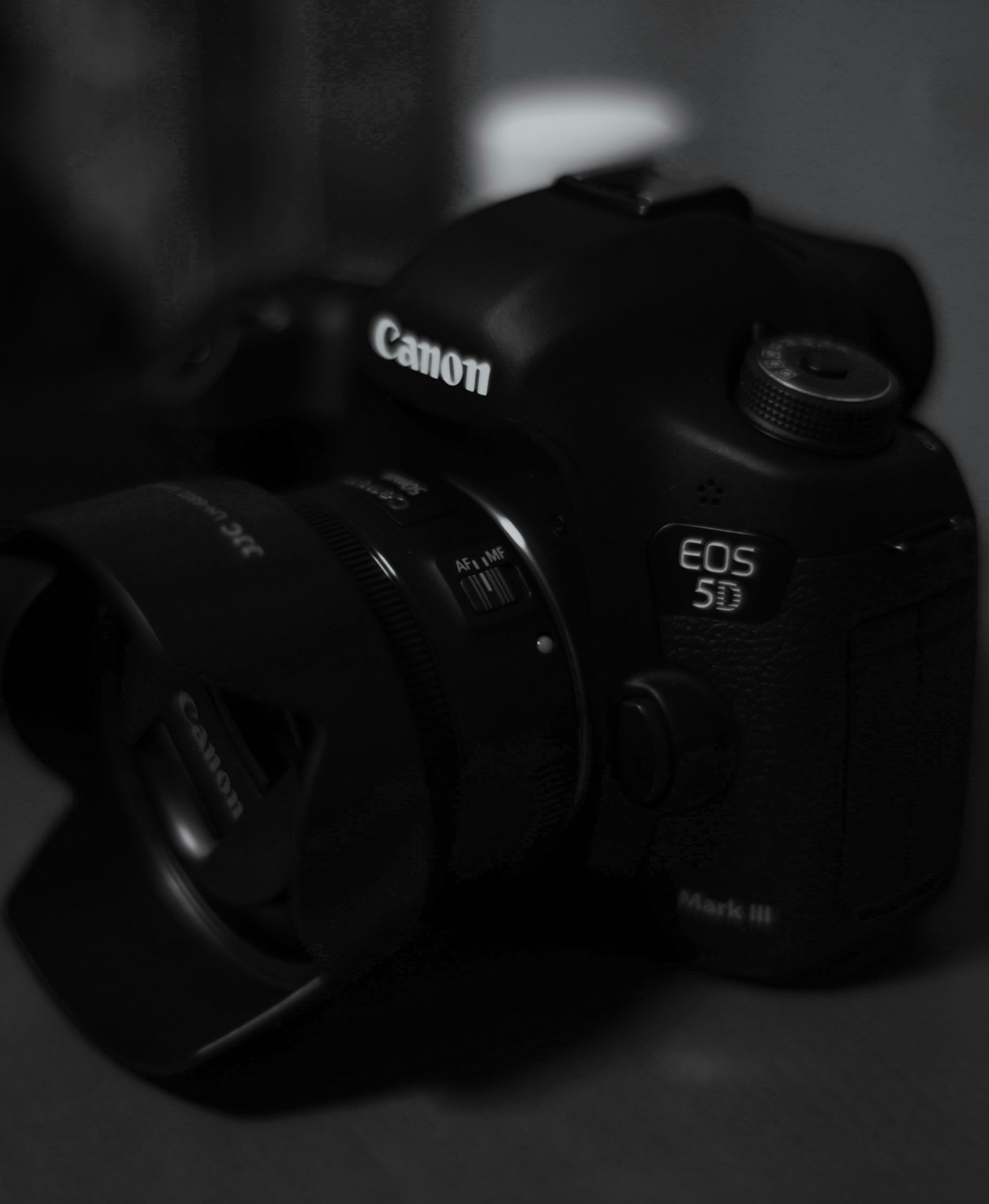
Photo by っぽ
Evolution and Meaning of the Logo
Canon's roots trace back to 1933 with the 'Precision Optical Instruments Laboratory', and the original brand name 'Kwanon' was derived from the Buddhist deity Kannon. In 1935, the name was changed to Canon with an eye on international expansion, establishing it as a global brand.

©︎ Canon
In 1955, the current logo design was finalized. The vibrant red color was chosen to represent 'passion, energy, and trust', and it has been widely used in advertisements, packaging, and websites.
Why is the Red Logo Not Used on Cameras?
On the other hand, the red logo is not used on the product bodies, especially cameras. The reason is the philosophy that 'the logo should not be the main focus'.
For Canon, which has many professional products, a prominent logo could distract from the subject or the creator's focus, so a subdued monochrome logo is used. This is a common practice for cameras from other manufacturers as well, as a discreet appearance is required in video production and news reporting environments.
Modern Product Design and Logo Balance
In recent Canon cameras, particularly vibrant products like the 'EOS R50 V' for vlogging, the logo is kept monochrome. According to product designers, the logo color is carefully considered to ensure it does not stand out more than the subject.

Photo by tk
Red was considered 'too strong' and was ultimately not chosen, with gray being the final choice. In essence, Canon always ensures that the product's visual and brand logo harmonize without hindering the user's creativity.